
According to Google, searches for the term “infographic” have increased over 800% in the last two years. To date, there are 79,000,000 search results on Google for “infographic.”
Consumers like them because they are consummately useful for informing, entertaining, and even evoking emotion. Why wouldn’t you want to use infographics in your content marketing?
In the last four hours alone, the hashtag #infographic has been used 3,300 times, with monthly totals bouncing up to 342,000. While all of these numbers are interesting, don’t you think you’d be able to process them quicker if I’d have represented them visually? Science says yes: we process visual imagery 60,000 times faster than text, and this is part of the reason that infographics are so appealing in the age of the short attention span.
But making a good infographic isn’t easy. It requires a deft, creative design eye alongside a willingness to stick to branding and messaging. Here are the 10 infographics we feel most effectively combine originality in design while bringing clarity to numbers and recognition to the brands who’ve created them.
The best infographics of 2015 are some of content marketing’s finest examples of visually engaging content. As platforms for content continue to proliferate, it’s important to test new content types while also continuing to utilize those that have served you well in the past. Infographics might not be as sexy as vines or videos, but they are solid, tried-and-true options. Since 90% of the information we take into our brains is visual, it makes sense that these are among the best content types to deploy. As Adobe’s Social Intelligence report noted, posts that have images are 600x more likely to be shared on social media and to receive engagement elsewhere.
Here are the brands and publications that provided us with some of the best infographics ever made…
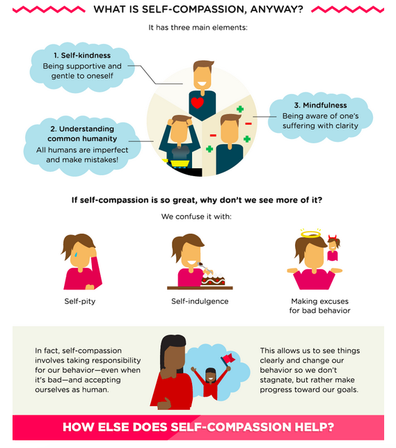
1. Refinery29: Self-Compassion: Here’s Why Science Says We Need More of It
One excellent way to do partner and native content in a way that’s completely genius and genuine? Infographics! That’s exactly what Refinery29 has done with web-based feel-good service Happify. This infographic includes helpful, actionable steps, explains self-compassion, and even evokes emotion with its simple cartoon illustrations. Most importantly: It’s something you would expect to find on Refinery in the first place.
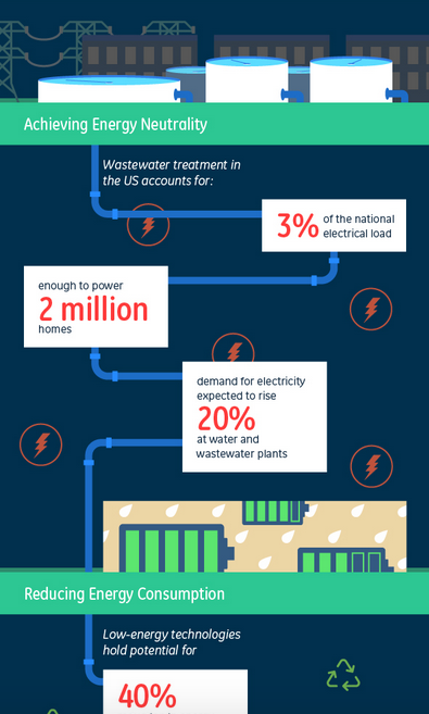
2. GE: Why Waste Energy On Wastewater?
Who can make an icky concept palatable and understandable? Why, that would be content marketing masters GE. While they also excel in the video and social media categories, their infographic game is also on point. This one explains the ins and outs of how wastewater can actually benefit humans to reduce our energy consumption. The best part about the infographic? Its use of numbers (which audiences love).
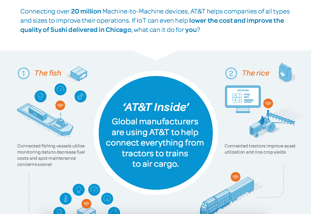
3. AT&T: When Did IoT Become A Part Of Ordering Sushi?
A masterful and too-rare example of a B2B infographic that won’t make you fall asleep on your screen. This one from AT&T is interesting even if you have no interest in IoT or sushi, because it combines these two incongruous topics and unites them to tell a story. Infographics are great for telling the story behind something technical, and this one excels at putting a fascinating spin on it.
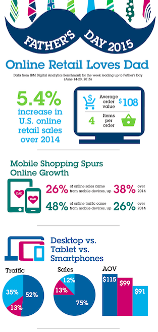
4. IBM: Online Retail Loves Dad
Again, B2B that’s not boring. IBM shared some of its business intel around Father’s Day spending with this infographic. The design is fun and seasonal, while also utilizing the brand’s signature fonts and color. It also marries the numbers behind the infographic with helpful icons that tell you quickly exactly the type of information you’re looking at. Win!
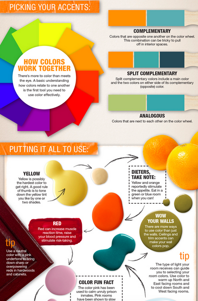
5. The Home Depot: Color Theory
Need to know how to do something in your home? Home Depot wants to be the go-to for these kinds of questions. Its color wheel infographic makes sure that homeowners can find exactly what they need, while educating them on aspects of color theory and design that they might not even know exist (complementary and split complementary colors, anyone?). Educating your consumer is always a thoughtful thing to do. When it’s done as beautifully as this, even better.
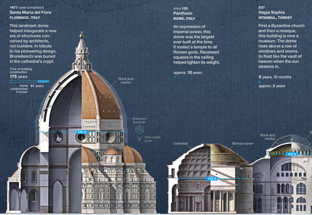
6. National Geographic: Redefining the Dome
Speaking of an education, here’s National Geographic’s incredibly detailed infographic on domes. How they’re built, where the most famous ones are, how much awe we should be in that someone figured out how to make them in the first place. With photo-realistic illustrations and helpful cutaways, as well as its interactive scrolling feature, it’s the perfect marriage of form and function. Kind of like domes.
7. The New York Times: What 2000 Calories Looks Like
This one might be the most viral infographic of 2015. This one cuts right to the chase in terms of visual information, showing you in photographic detail just what 2000 calories looks like. If you analyze it closely, you’ll see that it actually does break down the parts of a whole, which is another thing that audiences love about infographics.

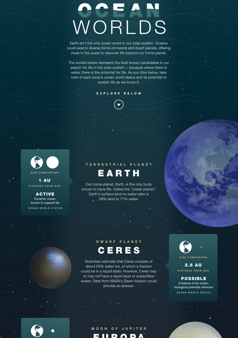
8. NASA Jet Propulsion Lab: Ocean Worlds
Maybe it’s not a surprise that NASA consistently publishes some of the best educational infographics out there. After all, they have the two key elements to a good infographic: data and interesting stories to tell. What’s more interesting than the big stories of how stars formed, or what’s going on in deep space? What’s more, they pay attention to design that’s atmospheric, immersing you in the subject you’re learning about. Ocean Worlds is no exception.
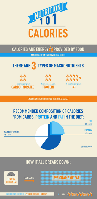
9. MyFitnessPal: Nutrition 101
Your content should always solve a problem for your audience. This infographic breaks down nutrition into bits and pieces, giving its fitness and weightloss-based audience something to chew on that really interests them. And, as a bonus, its design is both approachable and serious-looking to match.
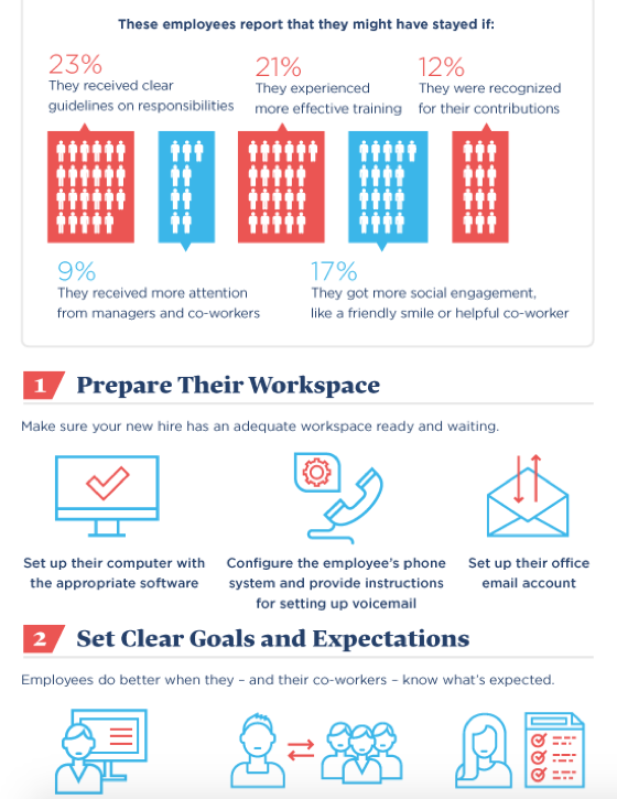
10. JUSTWORKS: Use Our New Hire Checklist to Create a Warm Welcome
This checklist infographic from JUSTWORKS has all the information managers need to create a warm welcome for their new hires. Again, this solves a problem for their audience that is common, and helps their audience members organize in a smart way to solve it. Combined with the types of quantified datapoints managers like to see, this one is an excellent match for the target demographic.
11. LinkedIn – A Well-Balanced Blog

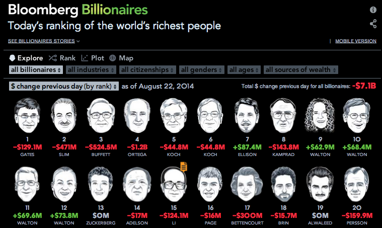
12. Bloomberg – Bloomberg Billionaires
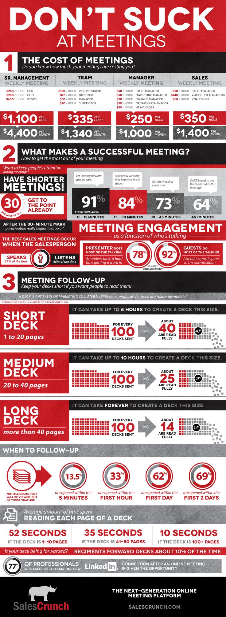
13. SalesCrunch – Don’t Suck At Meetings
14. Turbotax – Cost of Owning a Pet

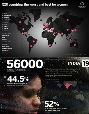
15. Thompson Reuters: G20 Countries: The Worst and Best for Women
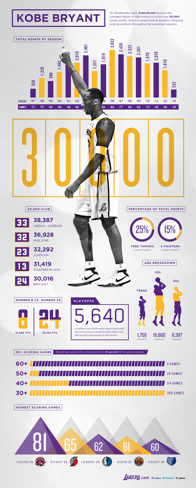
16. Lakers – Kobe Bryant
17. Bill & Melinda Gates Foundation, Johns Hopkins, IVAC – Vaccines Work

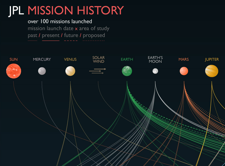
18. NASA Jet Propulsion Lab – Mission History
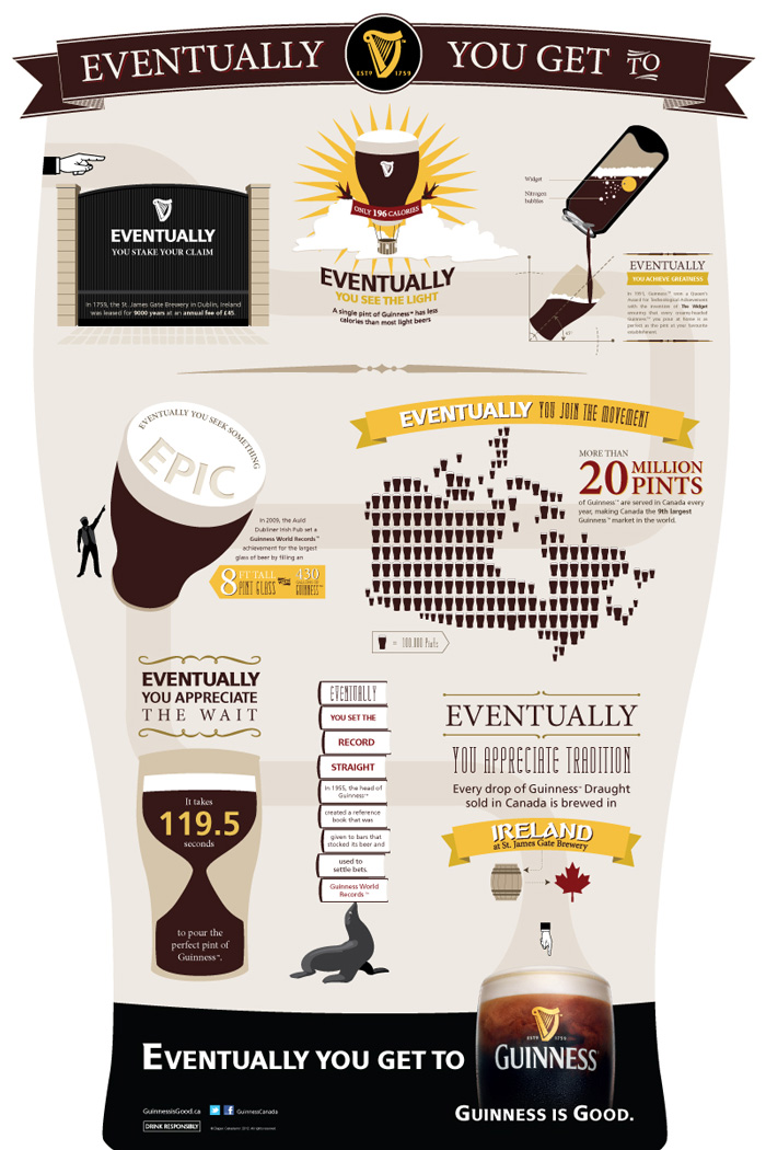
19. Guinness – Eventually You Get To Guinness
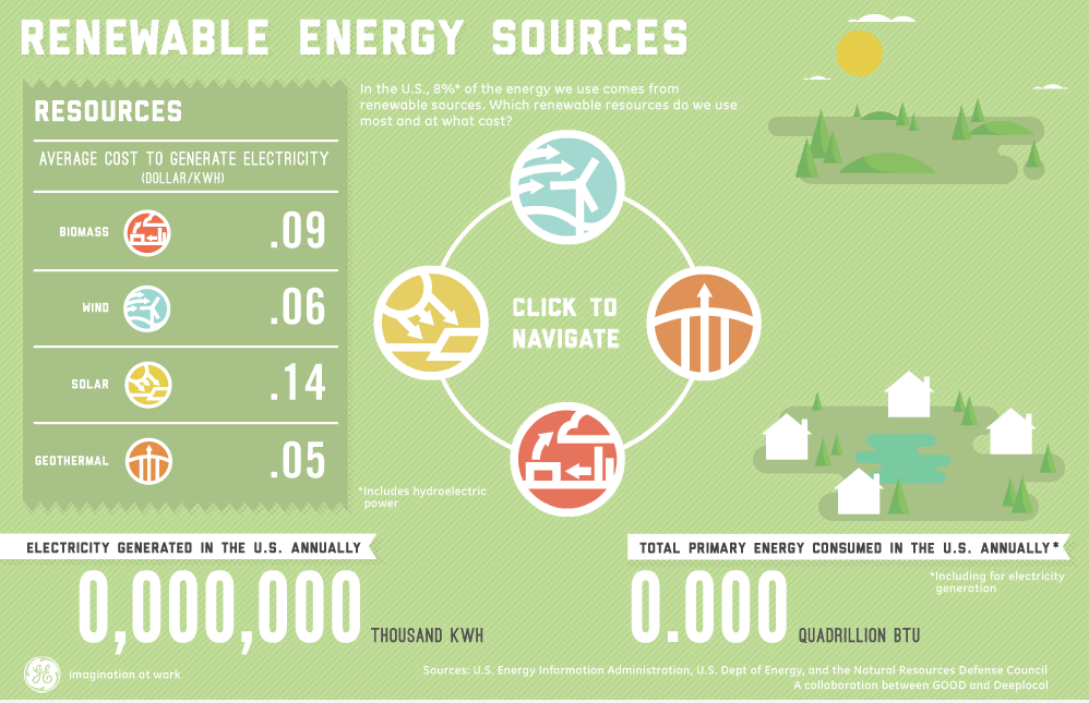
20. GE – Renewable Energy Sources
And for more great articles on great examples of infographics, check out:
- Fast Company’s Best Infographics of 2014
- Brainpicking’s Best Infographics of The Year
- Information Is Beautiful’s 2014 Award Winners
Compiled by Lauren Mangiaforte of NewsCred. This article originally appeared on the NewsCred Blog.
Are you interested in engaging and converting new customer for your business? Contact me here and let’s talk about how we can help.
The post 20 Super-Awesome Infographics to Inspire Your Content Marketing appeared first on Marketing Insider Group.
20 Super-Awesome Infographics to Inspire Your Content Marketing posted first on http://rssmix.com/u/11592782/rss.xml
No comments:
Post a Comment